Mary Parrish
Internal Promotional Materials Site
2023 / UX/UI Design for a SharePoint Site

My Responsibilities:
UX/UI Designer, Graphic Designer
Scope:
2023
My Tools:
SharePoint, Adobe Photoshop, Illustrator
Microsoft Office
Overview
As the sole designer at my company, my inbox was constantly filled with requests hindering me from getting my other, higher priority tasks completed.
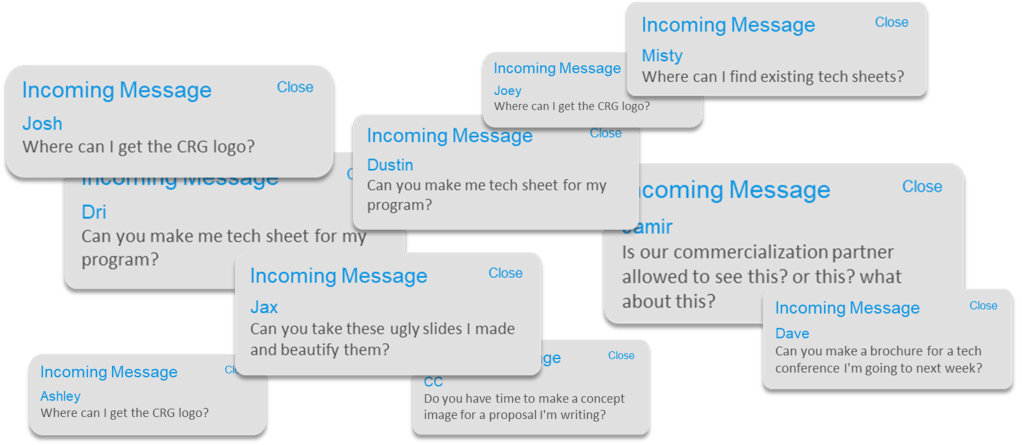
It was clear I needed to make a one-stop-shop for all promotional materials for anyone in the company to access. We had just adopted SharePoint, and everyone had their own headaches navigating the new platform. I was determined to make a site extremely intuitive to be used as an example for other departments.
Opportunities and Proposed Solutions
Below were my goals for creating a new SharePoint site for easy access to released promotional materials:
| Opportunity | Proposed Solution |
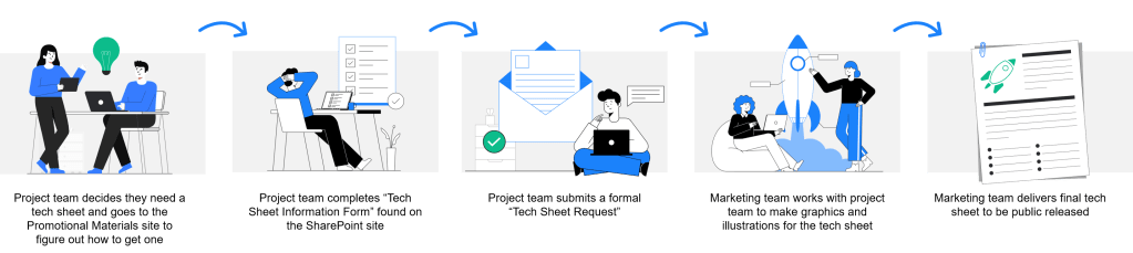
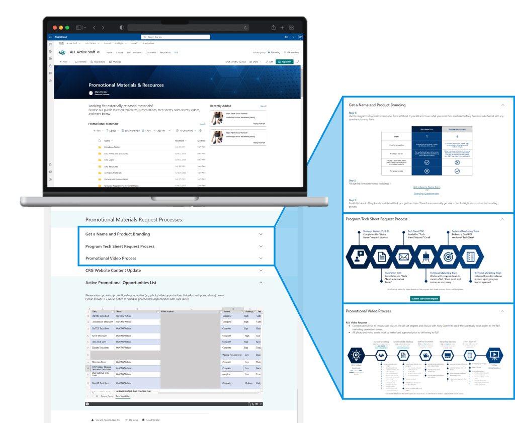
| Make it easier for CRG employees to request creative materials (tech sheets, flyers, brochures, tradeshow posters). | Create a formal process with an easy to understand infographic to go with it. |
| Make released materials (logos, flyers, tech sheets, etc.) more accessible to employees. | Create one formal location for all employees to access released materials. |
| Make it easier for Mary to organize priority and communicate progress/ timelines. | Provide a task board to keep everyone in the loop |
| Keep employees up to date on new releases without overwhelming them with notifications in their inboxes. | Provide a rolling updates list so people can stay in the know. |
| Don’t give people more headaches having to learn a new process. | Make everything extremely intuitive with the new site. |
Story Boarding
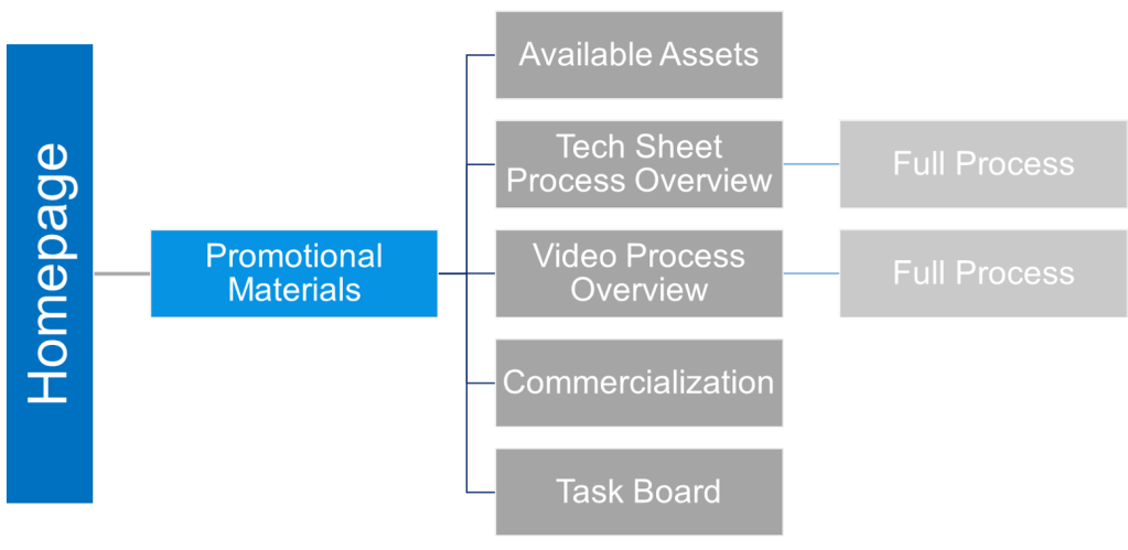
Information Architecture
Mockups and Sketches
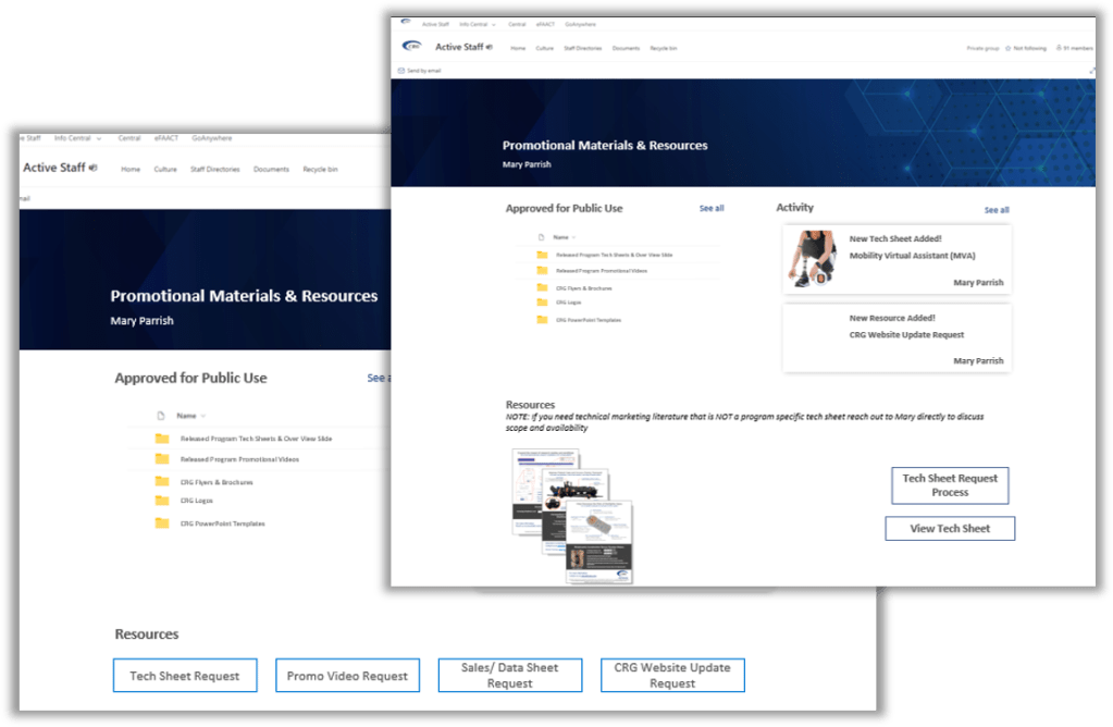
Once I had some nice looking processes outlined, I went right to making mockups. This was easiest to do in Microsoft PowerPoint. I had to use existing layout options in SharePoint, so after doing some research on what my options were, I started throwing some screen ideas together.
I also looked at the internal sites that the engineers were used to using. This helped maintain consistency, and made using a new tool easy to work with.
Soft Launch
A few insights here:
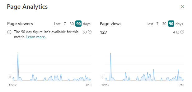
- Only 25% of potential users visited the site when I announced it. This meant that I needed to socialize it more.
- People didn’t understand the company’s “Get a Name” Process vs a full commercialization request. So I added a clarifying graphic for that.
- Some changes needed to be made to my tech sheet process to include our commercialization partner. This was good news!
Full Launch
Lessons Learned
- Designing for engineers: this was an interesting opportunity to understand designing interfaces for engineers. This wasn’t customer facing so there was not a lot of pressure on nailing the aesthetics, but there was a ton of pressure of getting the usability right.
- SharePoint: there are still a ton of features on SharePoint that I I have yet to discover, but having the opportunity to learn this tool was great.